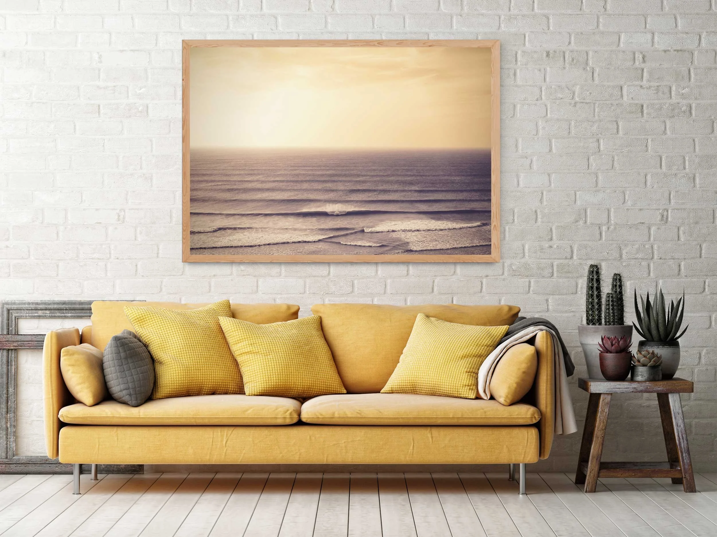
CRAFTING ART FROM PIXELS TO PAPER
Whipsiderry, Cornwall by Karl Mackie
BEHIND THE PRINT
I’m often asked how my prints come together and not just the photograph itself, but the texture, the finish, the weight in your hands. For collectors, there’s real value in knowing a print is part of a limited, numbered edition. Having a finite number not only adds value, it also encourages a more considered, minimalist mindset, both for the buyer and myself as the artist.
“THERE’S SOMETHING SPECIAL ABOUT TURNING A FLEETING MOMENT INTO A TANGIBLE, LASTING OBJECT”
This article isn’t a technical manual. It’s a behind-the-scenes look at how I work from the unexpected magic of a moment I didn’t plan, to the intention behind each frame, through paper selection, colour proofing, and the final crafting of a fine art print. Whether you’re a collector or a photographer curious about the process, this is how my prints come to life.
IT STARTS WITH THE INTENTION
Many times I’ve shot a roll of film knowing there’s maybe one, possibly two images on it that could work as a print. But for this article, I want to talk about intention.
Every image I shoot with the intention of printing is approached differently. Whether I’m waist-deep in the ocean with a film camera or composing a scene from a clifftop, I’m thinking ahead, visualising the image on a wall. My mind darts between creating negative space and managing the technical aspects of the shot, especially when working along the coast, where the light can shift in seconds and you’re constantly adjusting to the elements.
Once I’ve scanned the image, I edit with restraint. No heavy-handed presets or overly digital treatments. I shoot with grain in mind. I love the character of older, dated films, and I welcome light leaks and scratches (to a point). I’m always aiming to preserve the soul of the moment, which is why I choose film stocks that best suit the environments I’m working in.
For print, it’s essential to edit with the final output in mind. That means working in a high-resolution file (at least 300 DPI at print size), keeping colours within a printable gamut, and using a colour space like Adobe RGB. This stage is quiet, intentional work, my favourite time to edit is late at night, with good music and no distractions. It’s when I can fully focus on what the image wants to become.

Gwandra, Cornwall by Karl Mackie
2. PAPER IS HALF THE PICTURE
The paper you print on is just as important as the photograph itself. It changes everything not just how it looks, but how it feels. Texture, weight, and finish all influence how someone connects with a print.
When I began printing my work, I tested many different papers and quickly realised that textured Hahnemühle German Etching paper was the clear choice to represent my style. It has a soft, matte texture that holds shadow detail beautifully and lends each image a timeless, painterly quality. It works particularly well with images shot on film, enhancing the natural grain and subtle imperfections I love.
Choosing the right paper is about matching tone and texture. Interestingly, two very different images - Gwandra, captured off the Cornish headland, and Troika, a sun-drenched Biarritz coastline both sit perfectly on Hahnemühle German Etching. That versatility is why I keep coming back to it. It brings out the quiet strength in both muted coastal tones and warmer, brighter scenes alike.

Troika, Biarritz Surf by Karl Mackie
3. PROOFING THE PRINT ITSELF
Whether I’m printing in-studio or working with a trusted lab, the relationship between screen and paper is crucial. I use a calibrated monitor so that what I see on the screen closely matches what comes out on paper. Soft-proofing in Lightroom helps me anticipate how colours and contrast will shift once the image leaves the digital space.
For new work, I always run a series of proofs before signing anything off, especially for my large-format prints, which come in at 60” x 40”. At that scale, every detail matters. An image can feel completely different printed at full size, and imperfections that are invisible on screen or even in smaller proofs suddenly become obvious. That’s why this stage is so important. The final version has to feel considered, precise, and fully resolved.
“EACH LIMITED EDITION PRINT IS SIGNED AND NUMBERED BY HAND”
There’s a certain moment, after the final proof, when the print comes back and everything just clicks, the tones are right, the grain sits exactly where it should, and the image feels like it’s breathing. That’s the point I know it’s ready to leave my hands and live on someone else’s wall. There’s something deeply satisfying about that, It’s not just creating the work, but finishing it properly. It’s part of the process I’ve come to love: that final 5%, where precision and instinct meet.
Each limited edition print is signed and numbered by hand. I believe in keeping it personal - not mass-produced. This is your piece, made with care.

Illusory, Watergate Bay by Karl Mackie
4. FRAMING AND PRESENTATION
A print deserves proper presentation. I offer customers the choice to receive work either unframed or professionally framed using archival materials, acid-free mounts, UV-protective glass, and frame finishes that complement the mood of the image without overpowering it.
Just as I spent time carefully choosing the right paper for my prints, I took the same approach with framing. I decided on wooden frames in a choice of black, white, or natural wood keeping the look minimal and allowing the photograph to take centre stage.
“ALL FRAMES ARE MADE LOCALLY BY MOJO FRAMING HERE IN CORNWALL”
All frames are made locally by Mojo Framing here in Cornwall, and I use a dedicated art courier to deliver framed work safely across the UK.
If you’re not framing right away, I pack everything with conservation in mind, acid-free tissue, protective sleeves, and sturdy tubes or flat boxes for worldwide delivery. Each element of the packaging is chosen with the same care as the artwork itself.
A lot of thought goes into how the work arrives. I’ll never forget opening my first Apple product and quietly thinking I should keep the box such was the experience of joy. That stayed with me. The unboxing should feel like a moment in itself.
5. CARING FOR YOUR PRINT
Fine art prints are made to last, but a little care goes a long way. These pieces are produced to archival standards, using pigment inks and museum-grade paper, but how they’re displayed and handled plays a big role in their longevity.
Here’s how to protect and preserve your print for years to come:
Keep out of direct sunlight unless framed with UV-protective glass
Even with archival inks, direct sunlight can cause fading over time. If your print is going in a bright space, UV-protective glazing will help shield it from long-term damage while keeping the colours true.
Avoid hanging in rooms with high humidity
Places like bathrooms or kitchens can cause the paper to warp or the mount to expand and contract. Fine art paper is sensitive to moisture, and even a little can affect the structure and finish over time.
Always handle with clean hands or cotton gloves
Oils from your skin can transfer onto the paper and leave marks especially visible on matte or textured stock like Hahnemühle. If you’re unboxing or re-framing, handle the edges only, or wear clean cotton gloves for peace of mind.
If storing, use acid-free backing and sleeves
If your print isn’t going straight on the wall, store it flat between acid-free sheets or in a portfolio case. This protects the surface from dust, scratching, or discolouration caused by cheaper storage materials.
Let the paper breathe - don’t keep it tightly rolled for too long
While prints are often shipped rolled in sturdy tubes, they’re not meant to live that way. Keeping them tightly rolled for extended periods can cause the paper fibres to stay curled or crease when unrolled. Aim to frame or store them flat within a few weeks of delivery.

Daydream, Classic Landrover by Karl Mackie
WHY THIS MATTERS
In a world of fast content and fleeting likes, the print is slow. It’s deliberate. It’s a physical artefact of a moment, a piece of art that invites you to pause and feel something.
I love buying artwork. I love seeing my own work in print. But more than anything, I take so much from hearing how a print has made someone feel or why they chose it. Over the years, I’ve heard some incredible stories: from heartbreak to celebration, romantic gestures to remembering a place that once meant everything.
That’s what makes it all worth it.
If you’ve got questions about any part of the process, drop me a message. Whether you’re a budding photographer or a curious collector, understanding how prints are made adds a whole new depth to the experience.
You can find more of my work on Instagram: @karl_mackie, and on my website: karlmackie.com